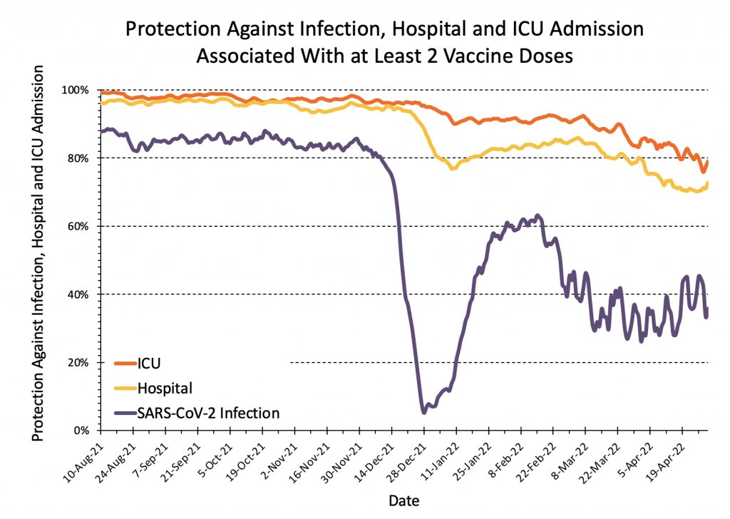
Hey @COVIDSciOntario, love your dashboard but isn’t it time to add a “with booster in past 6 months” vaccine effectiveness chart? “At least 2 doses” is now <80% protective against ICU and falling! https://covid19-sciencetable.ca/ontario-dashboard/#riskbyvaccinationstatus
These graphs did an excellent job explaining the value of vaccination to Ontarians right up until December. Now they’re really failing to capture the most valuable opportunity. What gives?

